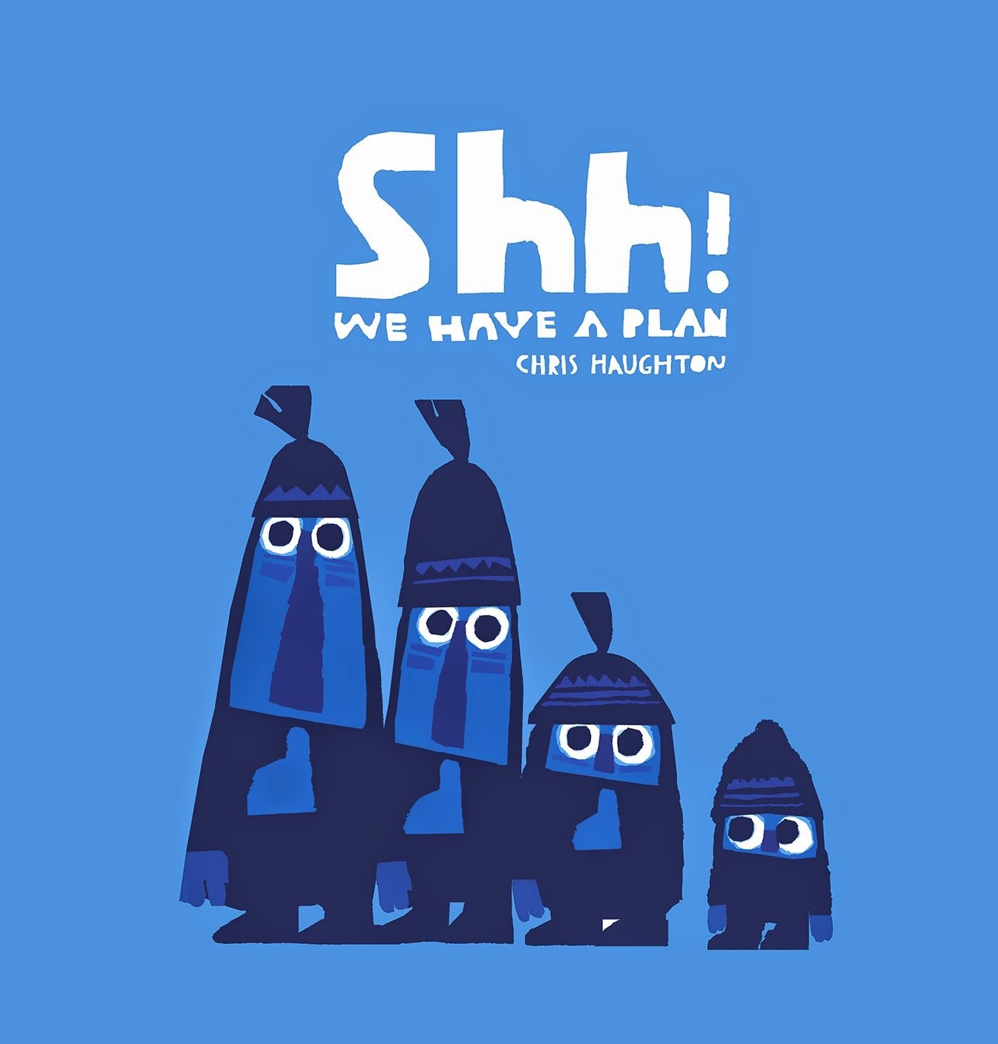
by Chris Haughton
Candlewick 2014
Four black-ops solders take on an impossible night mission with little hope of success. Just kidding!
In the depths of a purple-blue night four night stalkers our out with their nets in hopes of coming across something to catch. Actually only three of the stalkers have nets, the smallest seems to be tagging along. When they come across a bird the Little One cannot help but call out "Hello, Birdie" but is quickly hushed. "Shh! We have a plan."
Following the Rule of Threes the older trio creep stealthily upon the bird on the ground, in a tree, and out on a frozen pond, always failing to catch their prey. At last the Little One offers up some bread crumbs and they stalkers are suddenly surrounded by many birds. With the birds so close it seems as if catching them will easy until they realize they are outnumbers and outsized and off the run.
When they see a squirrel they turn to Little One. "Shh. We have a plan." And thus we end back where we started, with the stalkers unwilling to accept the truth and Little One shrugging at the reader.
Is it a lesson in respecting and protecting small creatures? The triumph of innocence over mischievous adventures? A subtle anti-hunting tract?
How about kids being kids?
Kids getting a notion in their head and proceeding with what they believe is a well-considered plan only to have it fail due, in part, to their own limited understanding of the real world.
Okay, I'll get out of the deep end now.
Stylistically, Shh! We Have a Plan is dark, but it's the darkness of night, the darkness of woods where even the light of the moon only makes things look various shades of blue. The human characters have a ragged torn-paper look to their edges while the natural elements have a cleaner simplicity to their shapes. The animals in particular, with their bright reds and greens and geometric shapes, are reminiscent of Alexander Girard without mimicry. A hat-tip in general to mid-century modern in both design and storytelling is owed here from Haughton who, it seems, has a genuine affinity for the naif.
Showing posts with label midcentury modern. Show all posts
Friday, September 12
Monday, November 28
The Day the Cow Sneezed
by James Flora
Harcourt, Brace & World 1957
reprinted by Enchanted Lion 2010
Noted Mid-century Modern illustrator tells a shaggy dog story. Not all illustrators are meant to be seen and heard.
"I bet your cow never sneezed a hole in the schoolhouse wall," begins The Day the Cow Sneezed, and truth be told, the cow in the story didn't either. Through a chain reaction like Rube Goldberg on steroids, the cow's sneeze precipitates a series of events that leads to a number of animals on progressively larger runaway vehicles doing much mayhem to country, town, school, zoo, and carnival rides. And when it was all over, and the world neatly set to right almost as quickly as it had been destroyed, little Fletcher (the boy whose neglect allowed the cow to catch a cold in the first place) is dragged off to the barn by his ear for a little good old-fashioned country discipline by Papa.
But you know what, forget the story. Don't even read it. It's a cumulative story that builds one preposterous whopper on top of another simply to provide Flora a canvas on which to draw this wild anarchy. It's like putting up with a few minutes of boring movie expository in order to get to the explosions. I really don't have a problem sometimes with dropping the whole set-up and starting with the second act in medias res.
Without the story – whose text is a tad tedious – the story makes a perfect madcap storyboard for a cartoon. It isn't sophisticated, but it isn't really much different from any other children's book in the mid 1950s, and the bold shapes and colors Flora employs show us just how tame most attempts at a retro style really are these days.
His influence at the time is nothing to be, ahem, sneezed at either. As the graphic designer for Columbia Records in the 40s and 50s Flora's work is iconically linked with hundreds of jazz recordings. It's a style you can recognize by sight, one that many hip parents back in the day might have been drawn to without even realizing the connection.
Having said that, it is understandable that the text might fall a little flat. Many great illustrators are able to convey good stories through images without really being able to do the same thing with text. Paul Rand was a genius of graphic design – logos for IBM, ABC, and UPS among others – but no matter how visually modern or stunning, few would call his Little 1 a great children's book. I'm not about to attempt to tar every graphic designer with the same brush and say none of them should write, but there are many, today even, who design and illustrate books they should not be writing themselves. I think sometimes illustrators are giving a pass because they can visually wow an editor that perhaps might intimidate them or make them fear they might lose a good book by suggesting that perhaps they should stick to pictures. It's hard to know for certain, and I admit I may be shooting in the dark here, but I do tend to find that the better picture books come from teams and not individuals.
Now watch, the next dozen books or so I read will completely prove me wrong.
Harcourt, Brace & World 1957
reprinted by Enchanted Lion 2010
Noted Mid-century Modern illustrator tells a shaggy dog story. Not all illustrators are meant to be seen and heard.
"I bet your cow never sneezed a hole in the schoolhouse wall," begins The Day the Cow Sneezed, and truth be told, the cow in the story didn't either. Through a chain reaction like Rube Goldberg on steroids, the cow's sneeze precipitates a series of events that leads to a number of animals on progressively larger runaway vehicles doing much mayhem to country, town, school, zoo, and carnival rides. And when it was all over, and the world neatly set to right almost as quickly as it had been destroyed, little Fletcher (the boy whose neglect allowed the cow to catch a cold in the first place) is dragged off to the barn by his ear for a little good old-fashioned country discipline by Papa.
But you know what, forget the story. Don't even read it. It's a cumulative story that builds one preposterous whopper on top of another simply to provide Flora a canvas on which to draw this wild anarchy. It's like putting up with a few minutes of boring movie expository in order to get to the explosions. I really don't have a problem sometimes with dropping the whole set-up and starting with the second act in medias res.
Without the story – whose text is a tad tedious – the story makes a perfect madcap storyboard for a cartoon. It isn't sophisticated, but it isn't really much different from any other children's book in the mid 1950s, and the bold shapes and colors Flora employs show us just how tame most attempts at a retro style really are these days. His influence at the time is nothing to be, ahem, sneezed at either. As the graphic designer for Columbia Records in the 40s and 50s Flora's work is iconically linked with hundreds of jazz recordings. It's a style you can recognize by sight, one that many hip parents back in the day might have been drawn to without even realizing the connection.
Having said that, it is understandable that the text might fall a little flat. Many great illustrators are able to convey good stories through images without really being able to do the same thing with text. Paul Rand was a genius of graphic design – logos for IBM, ABC, and UPS among others – but no matter how visually modern or stunning, few would call his Little 1 a great children's book. I'm not about to attempt to tar every graphic designer with the same brush and say none of them should write, but there are many, today even, who design and illustrate books they should not be writing themselves. I think sometimes illustrators are giving a pass because they can visually wow an editor that perhaps might intimidate them or make them fear they might lose a good book by suggesting that perhaps they should stick to pictures. It's hard to know for certain, and I admit I may be shooting in the dark here, but I do tend to find that the better picture books come from teams and not individuals.
Now watch, the next dozen books or so I read will completely prove me wrong.
Labels:
10,
50s,
enchanted lion,
harcourt brace,
illustrator,
james flora,
midcentury modern,
picture book,
retro
Subscribe to:
Posts (Atom)


